Homepage Website Design:


Snapped Website Page:


WIN WEBSITE PAGE:
 CONTACT US WEBSITE PAGE:

 After reviewing my website with my Media Teacher, I have gained some feedback on how to improve my website and gain more marks, my feedback was as follows:
Observations:
Good Logo. Background images work well...change of hue/saturation/levels...subtle but nice. A lot of your page titles are Homepage...please change these as appropriate. No video (probably one of the images I can't see)
Homepage: Images missing. We need some text regarding what the user will find on the website...what is the purpose of the site? Make it clear. Not sure why the contact us link is at the bottom on the page...doesn't really make sense. You might be better off changing it for text related to the holiday or offering something else. The ASBO story, you need to introduce it to the homepage with some text eg. exclusive!!!
Top 40: Nicely done but I'm not sure that you need such a big image...this forces the user to scroll down...is this necessary? You might want to mention when the Top 40 will be on your channel so that viewers can watch it live or link to another part of your sire to watch last week's Top 40 (page does not need to exsist and link does not need to go anywhere but gives depth to the site)
What's On: Explain what the user will find on this page. Consider making your images smaller or adding more text to avoid lots of white space. Some of the programmes might have more infor elsewhere which you may want to link to. This will add depth to the site. You should have a daily TV schedule for your site. You can get around this by placing a link at the top of the page to the schedule before you tell people whats hot on the boom box
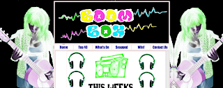
Snapped: Images missing. This would be an ideal exclusive for a link on the home page. Insert some text to explain what snapped is all about!
Win: Explain what the compos page is about, weekly, monthly, daily? Add links for further info and if people are phoning in their entried they need to be told how much this will cost per minute etc. as well as the minimum charge.
Contact Us: Images Missing. Make up e-mail addresses from the boombox website url you're going to make up - looks more professional. The job with boom box should be on its own page or a link from the home page maybe? Or maybe change to name of the page to get in touch with two sections. Image for Jamie is not very well cut out...consider re-doing this!
_______________________________________________
_______________________________________________
You have combined image and text very well though I still need to see a video clip (3)
Your technical skills are very good in terms of having created the site in Kompozer. Photoshop skills are evident, with laying on an image on the homepage. (3)
Your material does not quite communicate everything to the reader and I think you need to make a little more of the TV channel (i.e refer to it when talking about the show's characters etc.) (3)
Your material does not quite communicate everything to the reader and I think you need to make a little more of the TV channel (i.e refer to it when talking about the show's characters etc.) (3)
Navigation is logical...but there is not enough evidence of depth to your site. (3)
I'm grading your work as it currently stands at Level 3, with 30/40 and an estimated B grade. I'm pretty confident you'll get an A or A* with a few tweaks Becky.



 Snapped Page: