HEY!

Tuesday, 25 January 2011

Background and Colour Scheme

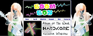
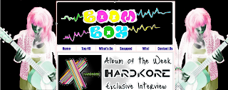
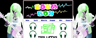
To add variety to my website, using photoshop i've decided to change the colour of the girl for each page. This gives each page the ability to explore another colour scheme and gives the website a larger target audience by not sticking to feminine or masculine colours. Below are the screenshots of a few pages and their new different colour scheme.

Homepage:
Top 40 Page:
Snapped Page:
What's On Page (in construction):

Different Pages on my Website

Today, I went up to the Apple Mac room to do some extra work on my blog and website, today I completed my work on my 'TOP 40' page and my 'Snapped' page.

TOP 40 PAGE
When completing my Top 40 page, I decided to link each of the songs to www.amazon.co.uk and to advertise my audience to download the mp3 of the so
ngs in my top 40. This means by using real artists I am crediting them for their music, as you can see from my screenshot, each artist is followed my a 'Download' link which is live and functioning
Snapped Page
Within my Snapped Page I have added the exclusive interview with my made up band 'HardKore' I have added the pictures that Heidi Russell has allowed me to use and I believe I have created an effective page for my audience, I am indecisi
ve whether I will add more news to my page, such as tour d
ates and small articles involving certain stars, but time will tell.


Monday, 24 January 2011

Interview with Band 'HardKore'

Album Of The Week
Exclusive Interview Pictures
Again, using Heidei's photography, I am using a few of her studio pictures of friends to create my band 'HardKore' these photos will feature on the page of the interview and will give the audience a closer insight to the band and what they're like:
Main Focus Picture of Band Members


Picture of Boy Member (Joey)

Picture of Female Member (Rachael)


Editing Photos using Photoshop


As I just recieved permission to use Heidi Russell's photography I have began working on a new background image, for the mean time I used a picture of a Neon DJ, which I obviously cannot use due to copyright infrigement. Therefore I have used this picture that Heidi took of JasmineCooke holding a guitar (original top left).


To fit in with the colour scheme and theme of my page I decided to edit the picture by inverting the colour and then doubling the picture next to it to create a mirrored image. I believe this fits my theme more and I am now happy with my background.


J-Weezy 18th Birthday Bash Editing.

Obviously, I did not have the time or money to set up a photoshoot with someone with a birthday cake or at a party, therefore, I decided to edit and transform a picture I found online.
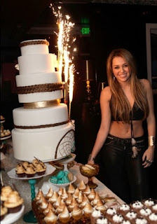
I obtained this picture of Miley Cyrus at her 18th Birthday Party, I got it from The Hollywood Gossip - you can find it by clicking this link: www.hollywoodgossip.com/gallery/18th-birthday-party


I then took a picture of my friend Jordon on a night out, so I transfered both of these pictures into photoshop .and used the magic eraser tool to delete the background of the picture of Jordon, so I was just left with the person, and removed Miley from the picture found on The Hollywood Gossip, I then rescaled the picture of Jordon so it looked realistic on the other photograph and edited the colours and shading around Jordon so it matched the background of the original picture.
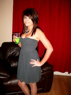
I then researched some fonts on http://www.dafont.com/ and again edited this in photoshop so it was coloured, I then added a last layer to my picture and places the text onto the image so I was left with the final result that you can see below:

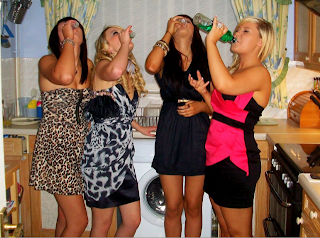
Help! I'm a teenage binge drinker - IMAGE MANIPULATION
When making an image for my exclusive programme, originally I was going to use all of the girls in the photo I took below, but I decided just to use the girl on the far right because I liked the angle she was standing and the fact that she is drinking from the whole bottle. This influences my programme and it's meaning.
I decided to have the article in black so it stood out against my white content background, therefore I manipulated the dress on the girl so it was white and pink rather than black and pink, making the girl stand out also again against the article. I then wrote a small article about the show and inserted different layers for text and finally inserted the image of the girl onto the main image. Creating the image I have below, featured on my What's On Page.


Copyright Free Photography

I have recieved permission off a friend studying photography at college to use some of her pictures within my website. I am currently in the middle of browsing through her portfolio to find specific photos I can use in my website.I facebook messaged her as that's how we met and I print screened the message as proof she gave me permission to use her material:


Website Design and Features

This is some of the features and designs I have created for my blog, without breaching any copyright laws.

This is the album cover I made on Microsoft Paint. I decided to go for a simple design so that the audience visiting my site will be intrigued to read the article about the CD. I decided to make my own CD cover so I didn't infringe any copyright laws. This Album Cover will be used for the Album of the Week section of my website "Boom Box" - (below)

This is my Top 40 logo which will feature on my homepage and on my Top 40 page, I have linked the image also on the homepage so by clicking on it you go straight to the Top 40. I got the font off http://www.dafont.com/ again because it does not contain copyright infringement, I also edited this further on photo shop. I also used the theme of green as this is what the colour scheme is on the Top 40 page, and it adds variety to the Homepage - (below)

This is also another advertisement for my top 40, the picture used is my friend Abigail Jones, she allowed me to use this picture as I believed it was quite celebrity like, this is similar to the way in which Viva! advertise their Top 40 on their website (shown below) through the use of research, I developed my own website around that of others. I edited the picture on photo shop and just left her eye coloured to show my developing skills on photo shop, and used the font from Microsoft Word.Viva Top 40 Advertisement (Below)


My own Top40 Advertisement - (Below)